Burnonomics 2.0 Is Live: The Chainflip Economics Dashboard for Holders, Traders, and Operators
Burnonomics 2.0 Is Live: The Chainflip Economics Dashboard for Holders, Traders, and Operators
Burnonomics 2.0 Is Live: The Chainflip Economics Dashboard for Holders, Traders, and Operators

Burnonomics 2.0 Is Live: The Chainflip Economics Dashboard for Holders, Traders, and Operators
Burnonomics has had a full rebuild. What started as a FLIP supply tracker is now a live command center covering the entire Chainflip economy: revenue, market structure, lending, flows, validators, and staking.
If you held a position on Chainflip, ran a node, market-made FLIP, or just wanted to see whether the burn was outpacing emissions this month, you used to need three or four different sources. Burnonomics 2.0 puts all of it on one page, refreshed live, with a freshness indicator at the top so you always know how recent the numbers are.
Here is a section-by-section tour of what is on burnonomics.com today.
Glance gives you the whole protocol in five seconds
The top of the dashboard (Glance) is a high-level snapshot designed to answer one question in five seconds: how is the protocol doing right now?
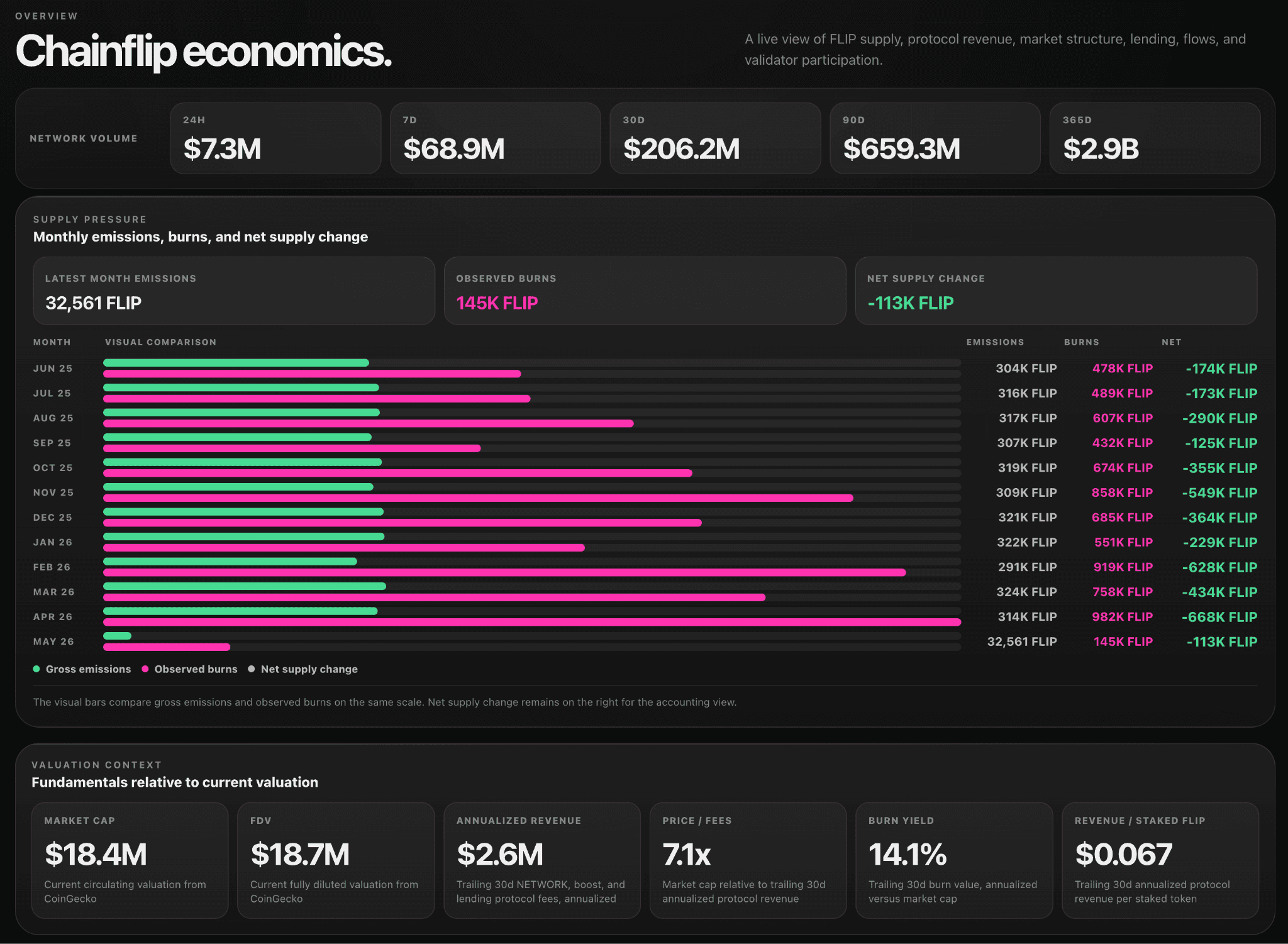
Network volume is shown across five trailing windows (24H, 7D, 30D, 90D, 365D), so you can spot whether the last day is in line with the trend or breaking from it. Below that, the supply pressure panel charts monthly emissions, burns, and net supply change going back nearly a year. April 2026 alone burned 982K FLIP against 314K emitted, a net reduction of 668K tokens. Looking at the full history, every month since June 2025 has been net deflationary.
The visual itself is a big step up from version one. Gross emissions and observed burns are plotted as horizontal bars on the same scale, side by side, with the running net change on the right. You can see at a glance which months had the heaviest burn pressure (Feb 26 at 919K and Apr 26 at 982K) and how emissions have stayed relatively flat at around 300K per month while burns swing widely with swap volume.
Economics turns Chainflip into a public company you can audit
The Economics section treats Chainflip the way you would treat a public company, and version 2.0 makes it sharper.
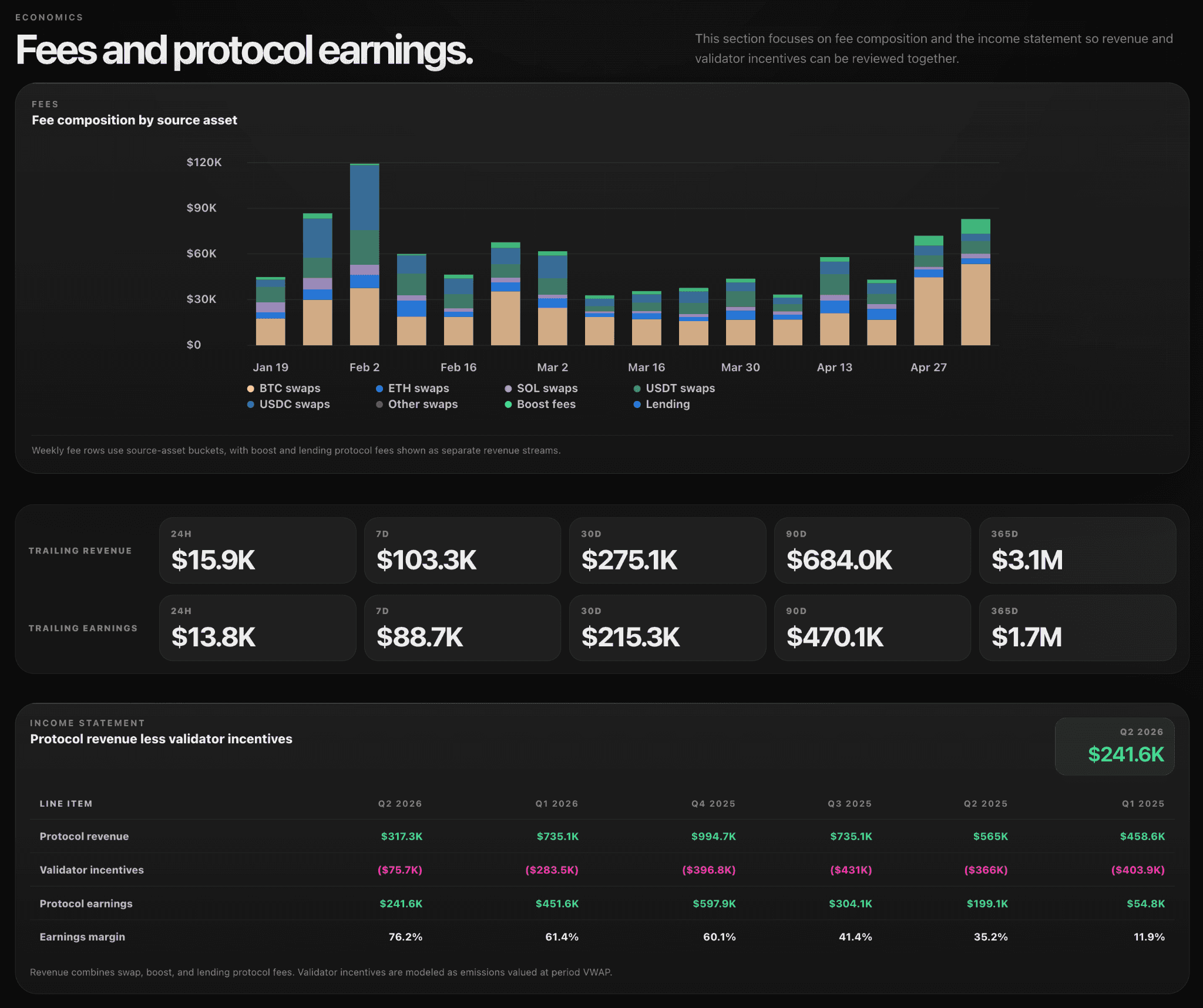
The new addition is the fee composition breakdown. Fees are now split by source asset (BTC, ETH, SOL, USDT, USDC, and others) plus boost and lending fees as separate revenue streams. You can see exactly which asset class is generating revenue week to week, which the previous version did not surface.
The income statement remains the centerpiece. Quarterly protocol revenue, validator incentives, protocol earnings, and earnings margin are laid out from Q1 2025 through Q2 2026.
Market structure shows price, depth, and flow in one place
The Market section is where traders and market makers will spend most of their time. It surfaces four distinct views of FLIP market structure.
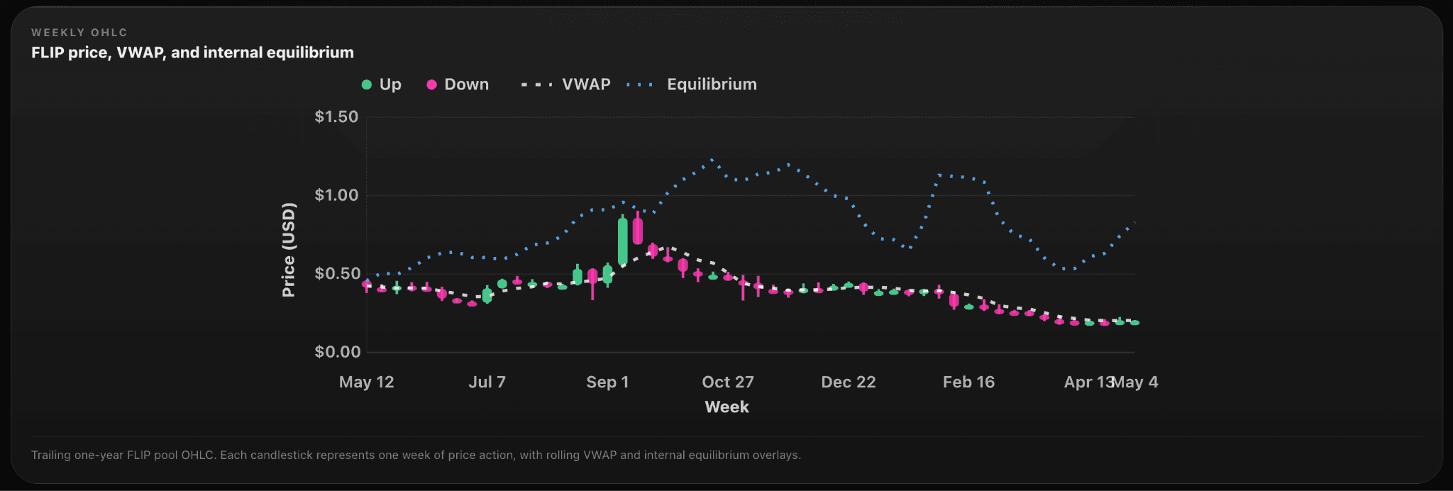
The weekly OHLC chart shows FLIP price action as candlesticks across a trailing one-year window, with rolling VWAP and an internal equilibrium line layered on top. It is a clean way to see where the market is trading relative to where the protocol's internal pricing model says it should be.
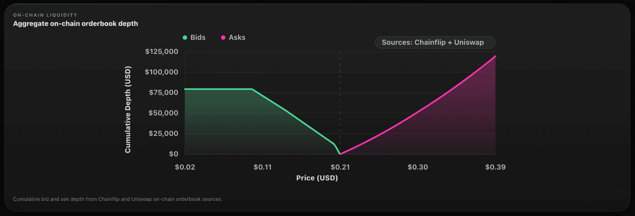
The on-chain orderbook depth chart aggregates cumulative bid and ask liquidity from Chainflip and Uniswap, plotted across a price range from $0.02 to $0.39. You see exactly how much depth sits between the current mid and any given price level.
The liquidity context tiles break depth out by percentage band (1%, 2%, 5%, 10%, and 25%) with bid and ask figures side by side. At the bottom is the source mix between Chainflip (66%) and Uniswap (34%).
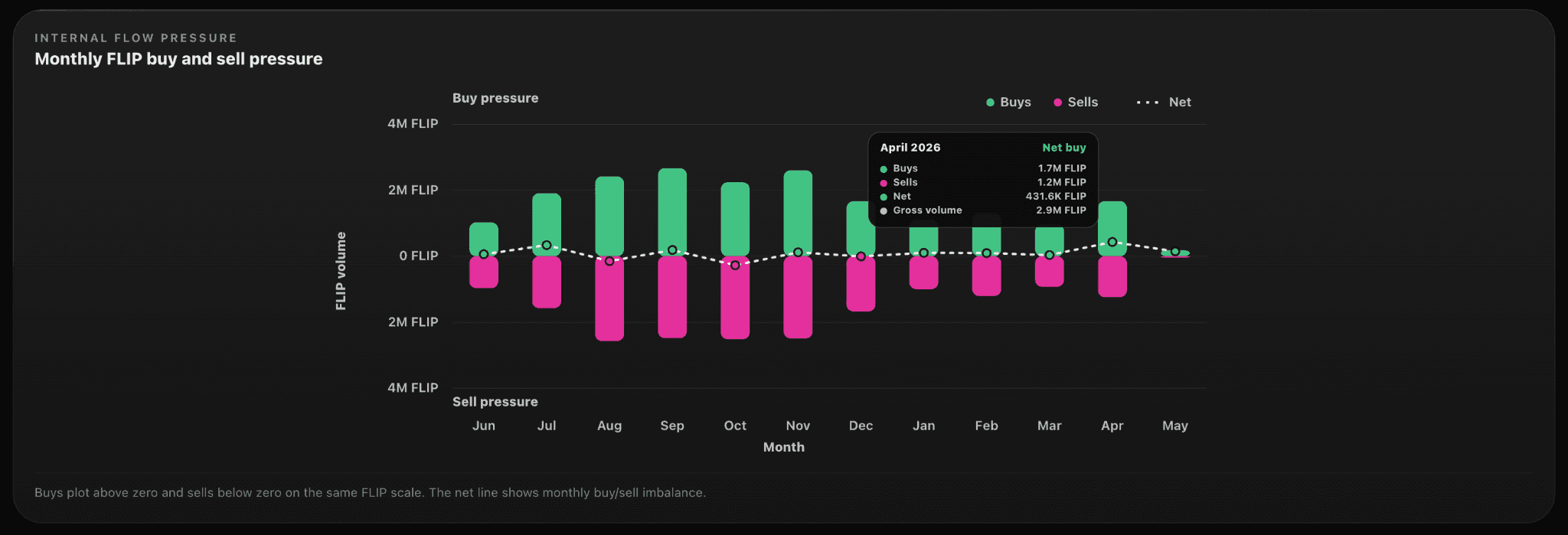
The internal flow pressure chart plots monthly FLIP buying above zero and selling below on the same scale, with a net line showing the imbalance. It is the single clearest visualisation of whether FLIP demand is structurally outpacing supply on Chainflip's own AMM.
Lending shows utilisation, runway, and unhealthy debt at a glance
Chainflip Lending now has its own section on Burnonomics, and it goes deeper than typical money market dashboards.
Headline metrics include utilisation (currently 88.6%, with $455.8K borrowed against $514.2K supplied), liquidity runway ($58.4K immediately available to borrow), and collateral coverage (204%, meaning $925.2K of collateral backs $453.5K of active debt).
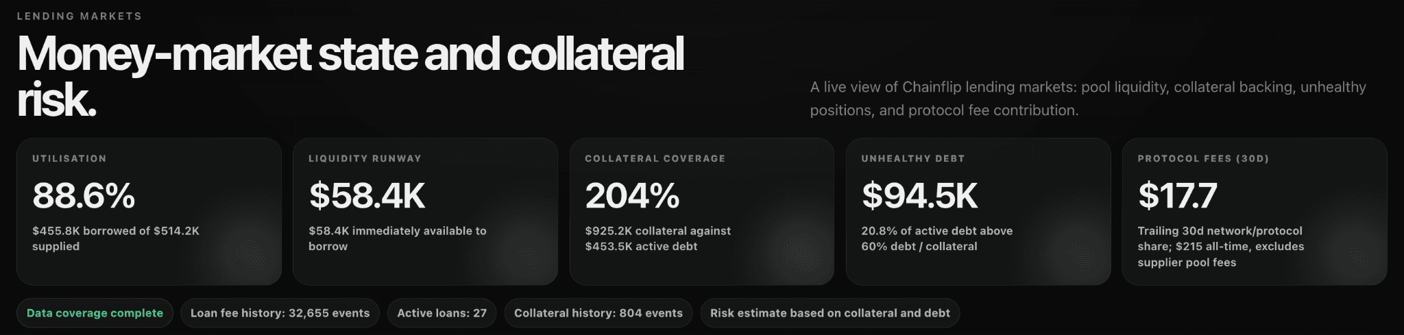
Headline metrics include utilisation (currently 88.6%, with $455.8K borrowed against $514.2K supplied), liquidity runway ($58.4K immediately available to borrow), and collateral coverage (204%, meaning $925.2K of collateral backs $453.5K of active debt).
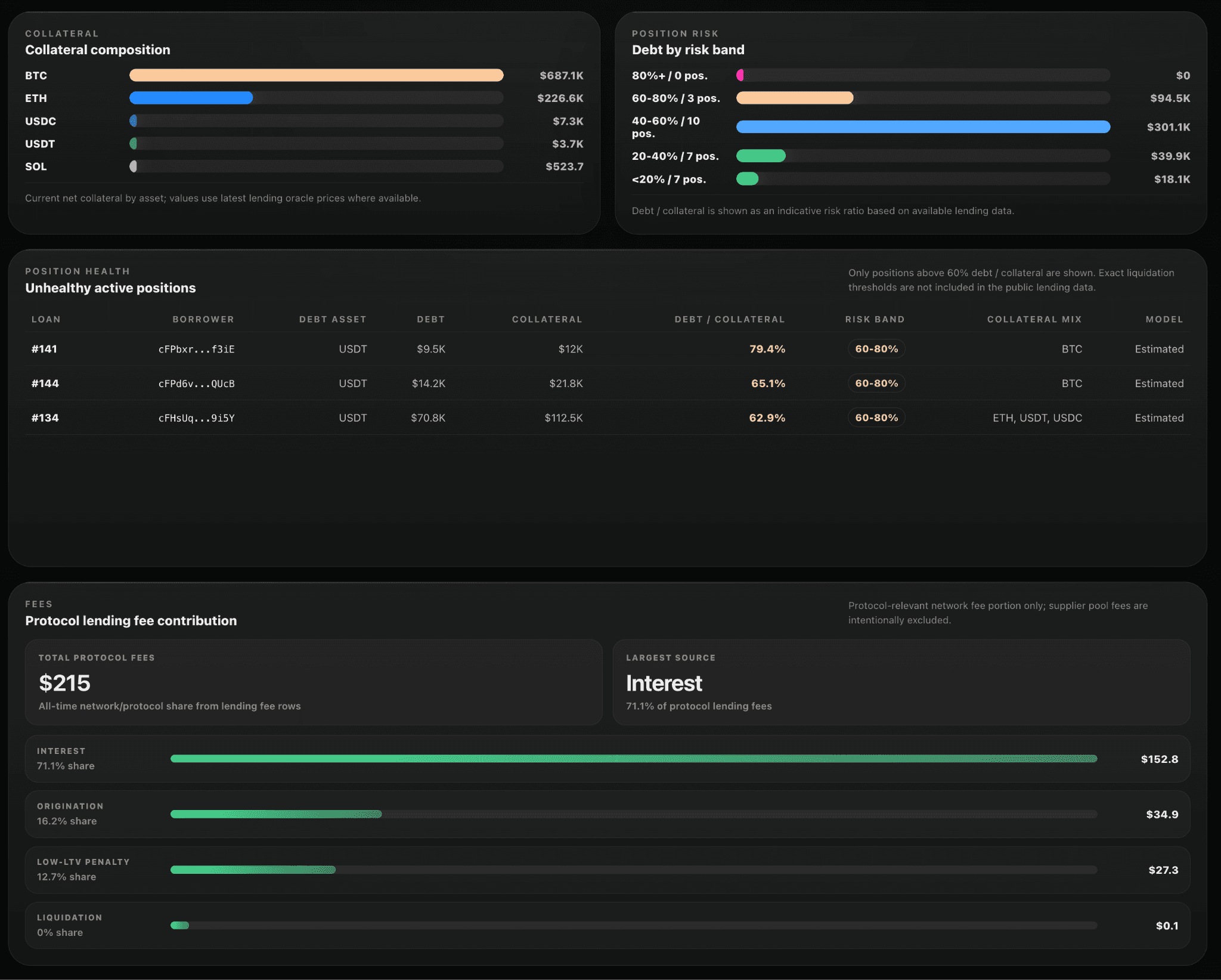
The collateral composition panel breaks down what is actually backing the lending market by asset. BTC dominates at $687.1K, with ETH ($226.6K) as the second-largest collateral type and USDC, USDT, and SOL filling smaller positions. It is the clearest signal of where lending demand is concentrated.
Debt by risk band distributes active debt across five buckets from under 20% debt-to-collateral up to 80%+. The bulk of debt sits in the 40-60% band ($301.1K across 10 positions), with $94.5K in the 60-80% danger band across 3 positions. No positions are currently above 80%.
The unhealthy active positions table is the standout. Every loan above the 60% debt-to-collateral threshold is listed with borrower address (truncated), debt asset, debt size, collateral, exact ratio, risk band, and collateral mix. Right now three positions are flagged: loan #141 at 79.4% (USDT debt, BTC collateral), #144 at 65.1% (also USDT/BTC), and #134 at 62.9% with a mixed ETH/USDT/USDC collateral basket. Position-level audit at this depth is genuinely rare in DeFi.
Protocol fee contribution from lending is broken out by source. Of the $215 collected all-time at the protocol layer (excluding supplier pool fees), 71.1% comes from interest, 16.2% from origination, 12.7% from low-LTV penalty fees, and a fraction of a percent from liquidations. It is a small revenue stream today, but the composition tells you which mechanism is doing the work.
Flows shows where cross-chain demand actually flows
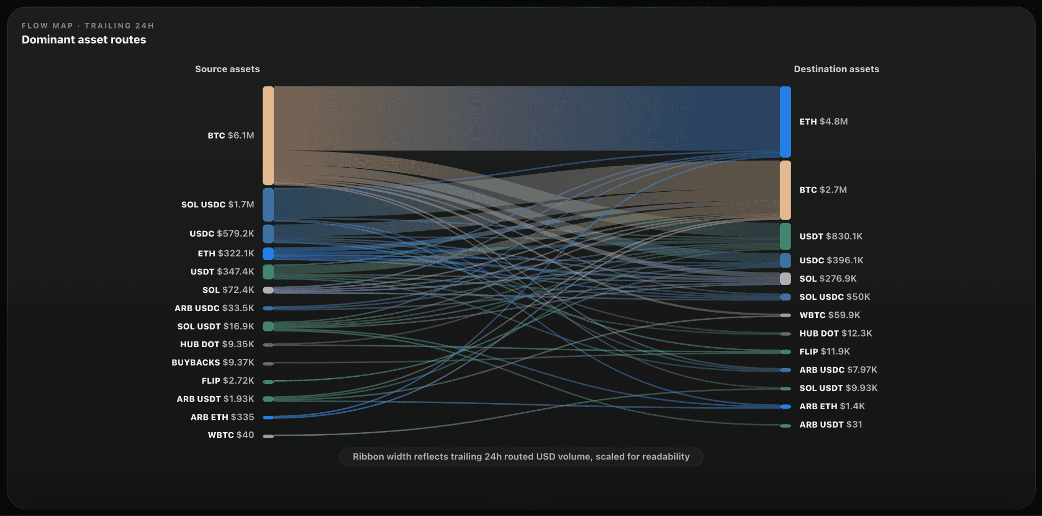
The Flows section shows where Chainflip volume is actually coming from and where it ends up.
The headline tiles cover trailing 24h flow volume ($9.1M), completed swaps (622), active asset pairs (55), and average swap size ($14.7K). Daily, weekly, and monthly views are all available.
The flow map is the standout visual. A Sankey diagram plots dominant asset routes across the trailing 24 hours, with ribbon width reflecting routed USD volume. BTC dominates source assets at $6.1M, while ETH leads destinations at $4.8M. The single largest route is BTC to ETH at $4.7M.
Route concentration is shown alongside, ranking the top 10 routes by routed volume. The top route (BTC to ETH) makes up 80.2% of displayed routes, with secondary routes like SOL USDC to BTC ($1.6M) and BTC to USDT ($688.5K) filling out the picture.
Net movement is the most analytically interesting piece. It shows net buying and selling by asset across the trailing window. Right now ETH is the largest net buyer at +$4.4M (with $4.8M bought against $322.1K sold), while BTC is the largest net seller at -$3.4M ($6.1M sold, $2.7M bought). USDT is also a net buyer at +$482.8K. It is a clean read on which assets the cross-chain demand is rotating into and out of.
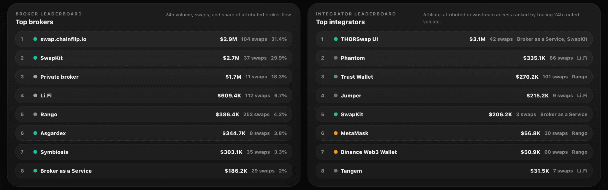
Ecosystem is the scoreboard for integrators and partners
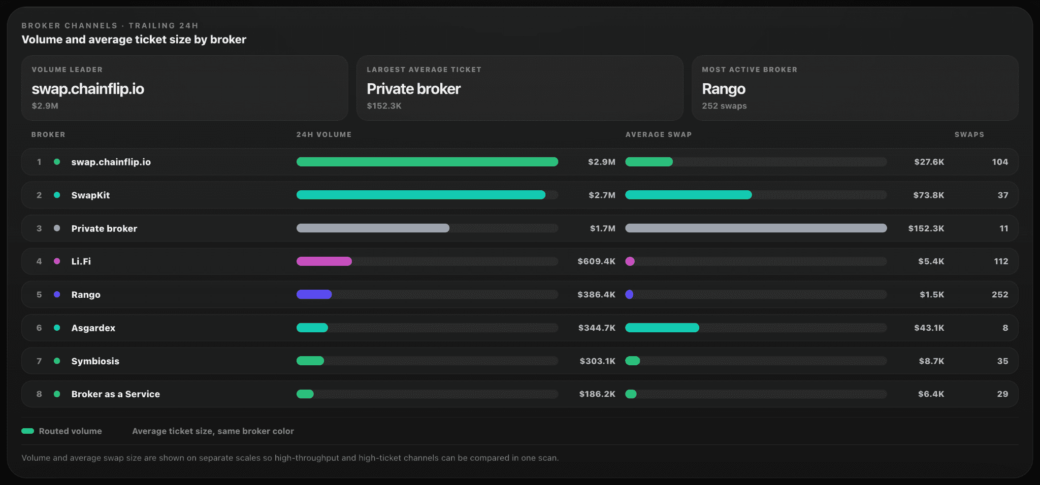
The Ecosystem section is the broker level overview. Three headline tiles set the picture: leading broker (swap.chainflip.io with $2.8M routed and 31% share), top 3 concentration (79.5% of attributed volume), and median channel size ($15.5K weighted average).
The broker channels table is the full leaderboard. Each broker is ranked by 24h volume with average swap size and swap count shown side by side. swap.chainflip.io leads volume at $2.8M, SwapKit follows at $2.7M, and a private broker sits at $1.7M with the largest average ticket at $152.3K. Rango is the most active broker by raw count at 252 swaps. Li.Fi and Rango both run high-volume, low-ticket channels. Symbiosis, Asgardex, and Broker as a Service round out the active set.
The dual-axis layout (volume on one scale, ticket size on another) is what makes this table genuinely useful. You can see at a glance which brokers are retail oriented and which are producing institutional flow.
Staking gives a full read on validator network health
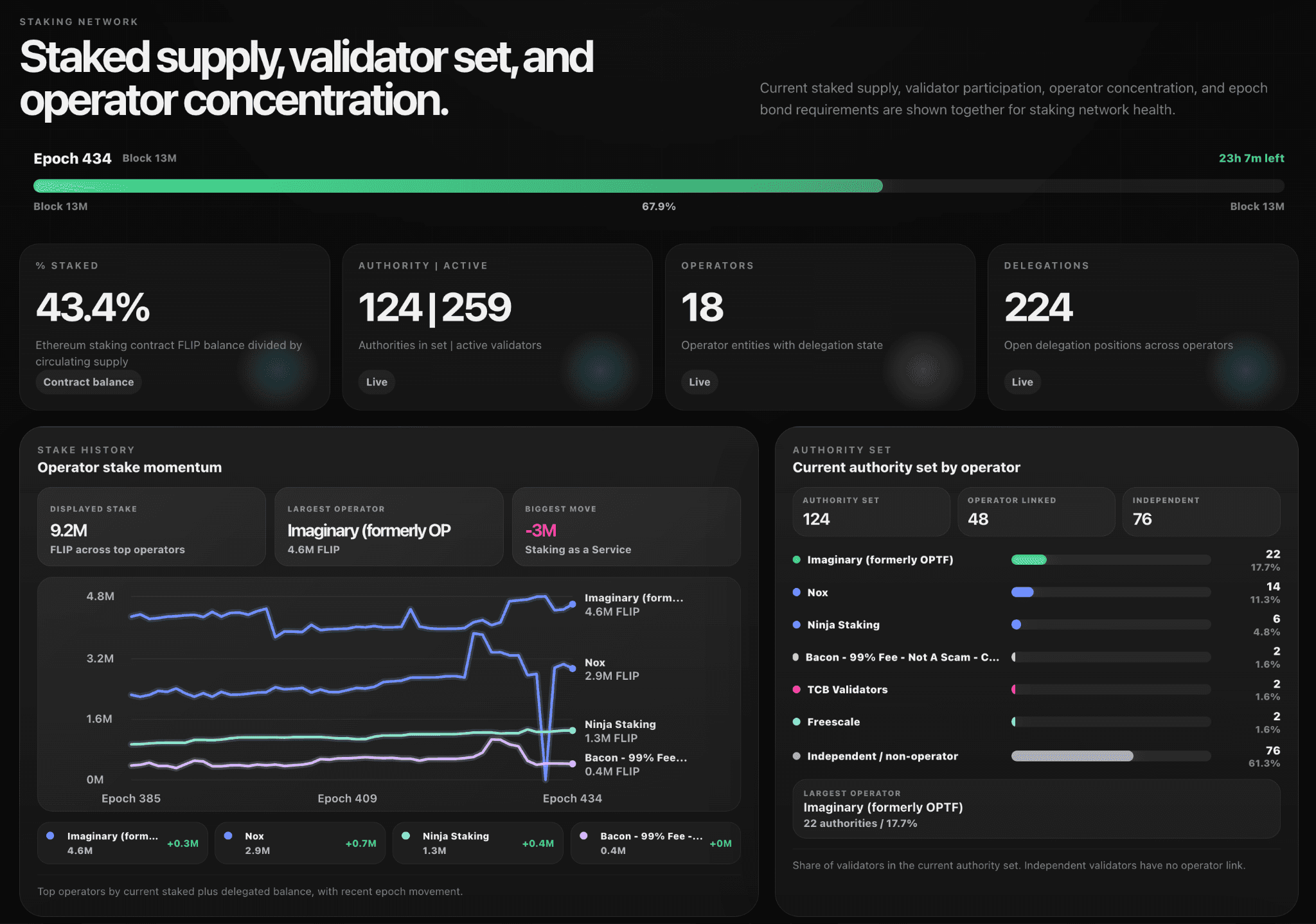
The Staking section gives a full read on validator network health.
You see the current epoch state (Epoch 434 at the time of writing, with 26h 40m left), the percentage of circulating supply staked (43.3%), and the active authority set (124 authorities out of 259 active validators).
Operator stats track 18 operator entities running 223 open delegation positions. The largest operator, Imaginary (formerly OP Stack), holds 4.6M FLIP. Stake history shows momentum across epochs, which is the closest thing the network has to a leaderboard for delegated stake growth.
The authority set breakdown splits the 124 active authorities into operator-linked (48) and independent (76). It is a clean view of how decentralised the validating set actually is.
Simulator lets you model the protocol economics yourself
The Simulator at the bottom is for the genuinely curious. It lets you model how protocol economics shift under different assumptions, building on the data shown in the rest of the dashboard.
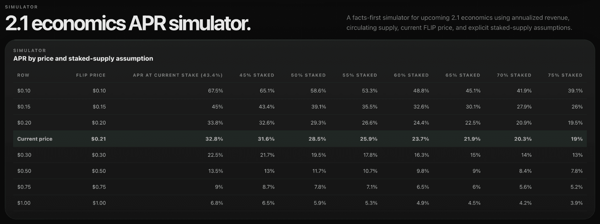
It is the kind of tool that turns Burnonomics from a passive dashboard into something you can actually reason with.
Burnonomics 2.0 matches a protocol that has gotten more complex
Chainflip's economic story has gotten more complex. The protocol now generates revenue from native swaps, boosted swaps, and lending. FLIP is bought back and distributed under tokenomics 2.1. Validators are incentivised through emissions valued at period VWAP. None of that fits in a single chart.
Burnonomics 2.0 is the answer to that complexity. It is not a marketing dashboard. It is a quant-grade transparency tool that lets anyone (holder, operator, market maker, researcher) verify the protocol's state in real time, with full data coverage statements next to every metric.
Burnonomics 2.0 is built and maintained by Agent Chud. Bookmark burnonomics.com and track the Chainflip economy live.
FAQ
What is Burnonomics 2.0?
Burnonomics 2.0 is a live dashboard covering Chainflip's full economy: protocol revenue, market structure, lending, flows, validators, and staking. It is refreshed in near real time with full data coverage and transparency next to every metric.
How is Burnonomics 2.0 different from the original?
The original Burnonomics focused on FLIP supply, burns, and emissions. Version 2.0 expands into eight sections covering protocol earnings (including a quarterly income statement), broker leaderboards, lending markets, validator network health, and a built-in economics simulator.
How often is the data refreshed?
Burnonomics 2.0 updates in near real time, with a freshness indicator at the top of the page showing exactly how recent the numbers are. Each metric also includes data coverage statements so you can verify the underlying dataset.
Where can I see Chainflip's protocol revenue?
The Economics section on Burnonomics 2.0 shows trailing revenue and earnings across 24H, 7D, 30D, 90D, and 365D windows, plus a quarterly income statement going back to Q1 2025. Visit burnonomics.com/#economics.
Resources
Burnonomics 2.0 - Live Chainflip economics dashboard
Swap Now - Start swapping native assets
Lend BTC - Borrow against native Bitcoin
Blog - Product updates and announcements
Chainflip Scan - Track swaps and network activity
Website - Explore Chainflip
Other Chainflip Products:
Boost - Earn fees by providing single-sided liquidity with no IL risk
Stablecoin Strategies - Deposit stablecoins and earn optimized yields
Provide Liquidity - Supply assets to Chainflip's liquidity pools
Stake FLIP - Delegate FLIP and earn staking rewards
Find us:
Burnonomics 2.0 Is Live: The Chainflip Economics Dashboard for Holders, Traders, and Operators
Burnonomics has had a full rebuild. What started as a FLIP supply tracker is now a live command center covering the entire Chainflip economy: revenue, market structure, lending, flows, validators, and staking.
If you held a position on Chainflip, ran a node, market-made FLIP, or just wanted to see whether the burn was outpacing emissions this month, you used to need three or four different sources. Burnonomics 2.0 puts all of it on one page, refreshed live, with a freshness indicator at the top so you always know how recent the numbers are.
Here is a section-by-section tour of what is on burnonomics.com today.
Glance gives you the whole protocol in five seconds
The top of the dashboard (Glance) is a high-level snapshot designed to answer one question in five seconds: how is the protocol doing right now?
Network volume is shown across five trailing windows (24H, 7D, 30D, 90D, 365D), so you can spot whether the last day is in line with the trend or breaking from it. Below that, the supply pressure panel charts monthly emissions, burns, and net supply change going back nearly a year. April 2026 alone burned 982K FLIP against 314K emitted, a net reduction of 668K tokens. Looking at the full history, every month since June 2025 has been net deflationary.
The visual itself is a big step up from version one. Gross emissions and observed burns are plotted as horizontal bars on the same scale, side by side, with the running net change on the right. You can see at a glance which months had the heaviest burn pressure (Feb 26 at 919K and Apr 26 at 982K) and how emissions have stayed relatively flat at around 300K per month while burns swing widely with swap volume.
Economics turns Chainflip into a public company you can audit
The Economics section treats Chainflip the way you would treat a public company, and version 2.0 makes it sharper.
The new addition is the fee composition breakdown. Fees are now split by source asset (BTC, ETH, SOL, USDT, USDC, and others) plus boost and lending fees as separate revenue streams. You can see exactly which asset class is generating revenue week to week, which the previous version did not surface.
The income statement remains the centerpiece. Quarterly protocol revenue, validator incentives, protocol earnings, and earnings margin are laid out from Q1 2025 through Q2 2026.
Market structure shows price, depth, and flow in one place
The Market section is where traders and market makers will spend most of their time. It surfaces four distinct views of FLIP market structure.
The weekly OHLC chart shows FLIP price action as candlesticks across a trailing one-year window, with rolling VWAP and an internal equilibrium line layered on top. It is a clean way to see where the market is trading relative to where the protocol's internal pricing model says it should be.
The on-chain orderbook depth chart aggregates cumulative bid and ask liquidity from Chainflip and Uniswap, plotted across a price range from $0.02 to $0.39. You see exactly how much depth sits between the current mid and any given price level.
The liquidity context tiles break depth out by percentage band (1%, 2%, 5%, 10%, and 25%) with bid and ask figures side by side. At the bottom is the source mix between Chainflip (66%) and Uniswap (34%).
The internal flow pressure chart plots monthly FLIP buying above zero and selling below on the same scale, with a net line showing the imbalance. It is the single clearest visualisation of whether FLIP demand is structurally outpacing supply on Chainflip's own AMM.
Lending shows utilisation, runway, and unhealthy debt at a glance
Chainflip Lending now has its own section on Burnonomics, and it goes deeper than typical money market dashboards.
Headline metrics include utilisation (currently 88.6%, with $455.8K borrowed against $514.2K supplied), liquidity runway ($58.4K immediately available to borrow), and collateral coverage (204%, meaning $925.2K of collateral backs $453.5K of active debt).
Headline metrics include utilisation (currently 88.6%, with $455.8K borrowed against $514.2K supplied), liquidity runway ($58.4K immediately available to borrow), and collateral coverage (204%, meaning $925.2K of collateral backs $453.5K of active debt).
The collateral composition panel breaks down what is actually backing the lending market by asset. BTC dominates at $687.1K, with ETH ($226.6K) as the second-largest collateral type and USDC, USDT, and SOL filling smaller positions. It is the clearest signal of where lending demand is concentrated.
Debt by risk band distributes active debt across five buckets from under 20% debt-to-collateral up to 80%+. The bulk of debt sits in the 40-60% band ($301.1K across 10 positions), with $94.5K in the 60-80% danger band across 3 positions. No positions are currently above 80%.
The unhealthy active positions table is the standout. Every loan above the 60% debt-to-collateral threshold is listed with borrower address (truncated), debt asset, debt size, collateral, exact ratio, risk band, and collateral mix. Right now three positions are flagged: loan #141 at 79.4% (USDT debt, BTC collateral), #144 at 65.1% (also USDT/BTC), and #134 at 62.9% with a mixed ETH/USDT/USDC collateral basket. Position-level audit at this depth is genuinely rare in DeFi.
Protocol fee contribution from lending is broken out by source. Of the $215 collected all-time at the protocol layer (excluding supplier pool fees), 71.1% comes from interest, 16.2% from origination, 12.7% from low-LTV penalty fees, and a fraction of a percent from liquidations. It is a small revenue stream today, but the composition tells you which mechanism is doing the work.
Flows shows where cross-chain demand actually flows
The Flows section shows where Chainflip volume is actually coming from and where it ends up.
The headline tiles cover trailing 24h flow volume ($9.1M), completed swaps (622), active asset pairs (55), and average swap size ($14.7K). Daily, weekly, and monthly views are all available.
The flow map is the standout visual. A Sankey diagram plots dominant asset routes across the trailing 24 hours, with ribbon width reflecting routed USD volume. BTC dominates source assets at $6.1M, while ETH leads destinations at $4.8M. The single largest route is BTC to ETH at $4.7M.
Route concentration is shown alongside, ranking the top 10 routes by routed volume. The top route (BTC to ETH) makes up 80.2% of displayed routes, with secondary routes like SOL USDC to BTC ($1.6M) and BTC to USDT ($688.5K) filling out the picture.
Net movement is the most analytically interesting piece. It shows net buying and selling by asset across the trailing window. Right now ETH is the largest net buyer at +$4.4M (with $4.8M bought against $322.1K sold), while BTC is the largest net seller at -$3.4M ($6.1M sold, $2.7M bought). USDT is also a net buyer at +$482.8K. It is a clean read on which assets the cross-chain demand is rotating into and out of.
Ecosystem is the scoreboard for integrators and partners
The Ecosystem section is the broker level overview. Three headline tiles set the picture: leading broker (swap.chainflip.io with $2.8M routed and 31% share), top 3 concentration (79.5% of attributed volume), and median channel size ($15.5K weighted average).
The broker channels table is the full leaderboard. Each broker is ranked by 24h volume with average swap size and swap count shown side by side. swap.chainflip.io leads volume at $2.8M, SwapKit follows at $2.7M, and a private broker sits at $1.7M with the largest average ticket at $152.3K. Rango is the most active broker by raw count at 252 swaps. Li.Fi and Rango both run high-volume, low-ticket channels. Symbiosis, Asgardex, and Broker as a Service round out the active set.
The dual-axis layout (volume on one scale, ticket size on another) is what makes this table genuinely useful. You can see at a glance which brokers are retail oriented and which are producing institutional flow.
Staking gives a full read on validator network health
The Staking section gives a full read on validator network health.
You see the current epoch state (Epoch 434 at the time of writing, with 26h 40m left), the percentage of circulating supply staked (43.3%), and the active authority set (124 authorities out of 259 active validators).
Operator stats track 18 operator entities running 223 open delegation positions. The largest operator, Imaginary (formerly OP Stack), holds 4.6M FLIP. Stake history shows momentum across epochs, which is the closest thing the network has to a leaderboard for delegated stake growth.
The authority set breakdown splits the 124 active authorities into operator-linked (48) and independent (76). It is a clean view of how decentralised the validating set actually is.
Simulator lets you model the protocol economics yourself
The Simulator at the bottom is for the genuinely curious. It lets you model how protocol economics shift under different assumptions, building on the data shown in the rest of the dashboard.
It is the kind of tool that turns Burnonomics from a passive dashboard into something you can actually reason with.
Burnonomics 2.0 matches a protocol that has gotten more complex
Chainflip's economic story has gotten more complex. The protocol now generates revenue from native swaps, boosted swaps, and lending. FLIP is bought back and distributed under tokenomics 2.1. Validators are incentivised through emissions valued at period VWAP. None of that fits in a single chart.
Burnonomics 2.0 is the answer to that complexity. It is not a marketing dashboard. It is a quant-grade transparency tool that lets anyone (holder, operator, market maker, researcher) verify the protocol's state in real time, with full data coverage statements next to every metric.
Burnonomics 2.0 is built and maintained by Agent Chud. Bookmark burnonomics.com and track the Chainflip economy live.
FAQ
What is Burnonomics 2.0?
Burnonomics 2.0 is a live dashboard covering Chainflip's full economy: protocol revenue, market structure, lending, flows, validators, and staking. It is refreshed in near real time with full data coverage and transparency next to every metric.
How is Burnonomics 2.0 different from the original?
The original Burnonomics focused on FLIP supply, burns, and emissions. Version 2.0 expands into eight sections covering protocol earnings (including a quarterly income statement), broker leaderboards, lending markets, validator network health, and a built-in economics simulator.
How often is the data refreshed?
Burnonomics 2.0 updates in near real time, with a freshness indicator at the top of the page showing exactly how recent the numbers are. Each metric also includes data coverage statements so you can verify the underlying dataset.
Where can I see Chainflip's protocol revenue?
The Economics section on Burnonomics 2.0 shows trailing revenue and earnings across 24H, 7D, 30D, 90D, and 365D windows, plus a quarterly income statement going back to Q1 2025. Visit burnonomics.com/#economics.
Resources
Burnonomics 2.0 - Live Chainflip economics dashboard
Swap Now - Start swapping native assets
Lend BTC - Borrow against native Bitcoin
Blog - Product updates and announcements
Chainflip Scan - Track swaps and network activity
Website - Explore Chainflip
Other Chainflip Products:
Boost - Earn fees by providing single-sided liquidity with no IL risk
Stablecoin Strategies - Deposit stablecoins and earn optimized yields
Provide Liquidity - Supply assets to Chainflip's liquidity pools
Stake FLIP - Delegate FLIP and earn staking rewards
Find us:

Swap
How-to
Bitcoin
Hyperliquid Deposit Fees Explained: What You Actually Pay vs Swapping Natively
Hyperliquid Deposit Fees Explained: What You Actually Pay vs Swapping Natively

FLIP Token
How-to
What Is Staking in Crypto? A 2026 Guide to How It Works and Where Yield Comes From
What Is Staking in Crypto? A 2026 Guide to How It Works and Where Yield Comes From